Green Cosmetik
[Client]
Green Cosmetik
[Services]
Visual Identity
Packaging
Illustration
[Industry]
Healthcare
[Year]
2023
[Infos]
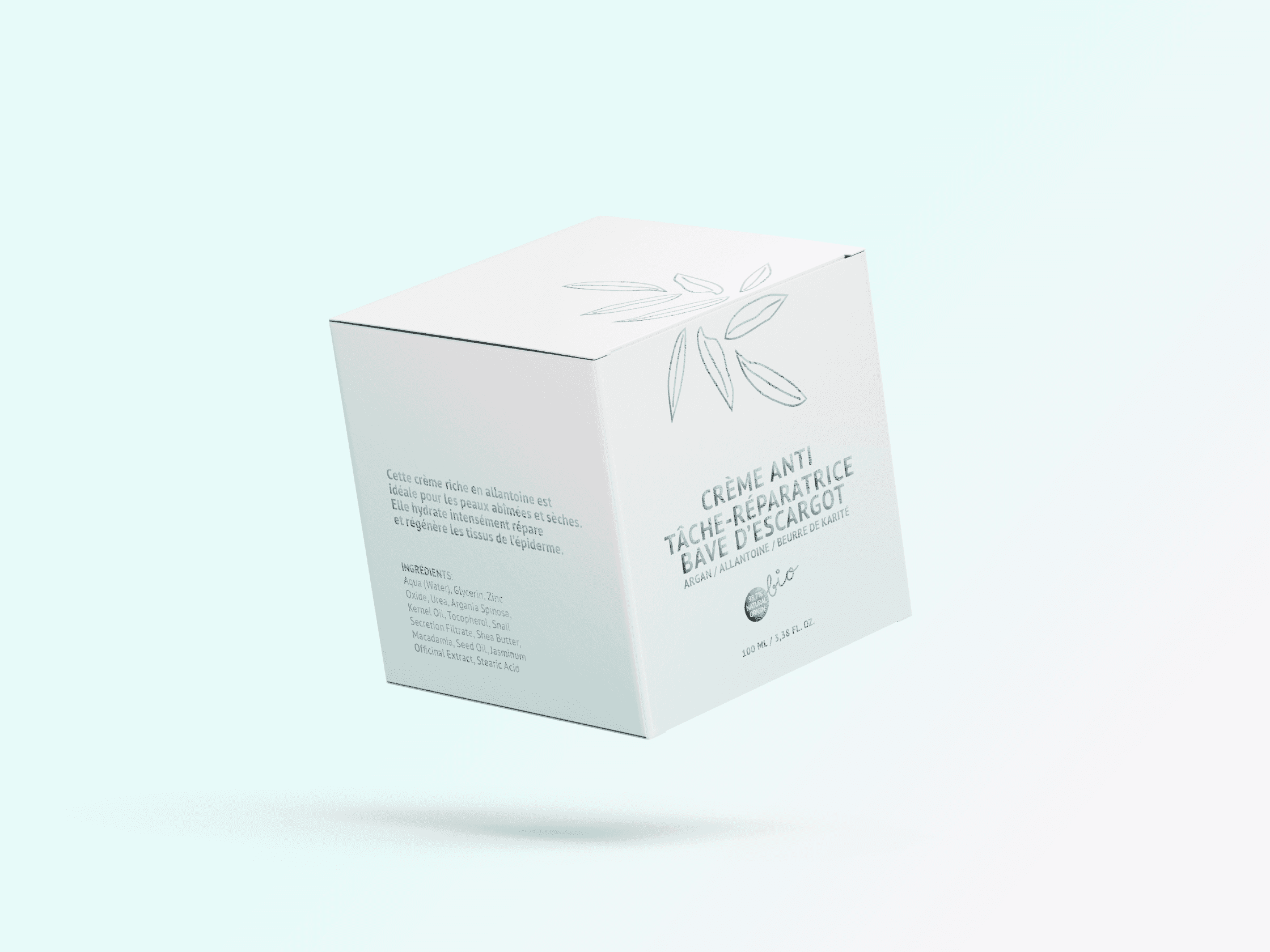
The visual language and packaging system for a natural skincare line created specifically for individuals with hyperreactive, atopic, and sensitive skin. The range included serums, creams, masks, lotions, soaps, and shampoos, all made exclusively from natural, plant-based ingredients. The strategic and creative direction was grounded in the idea of relief through design, aiming to evoke gentleness, calm, and trust from the very first glance. A soft pastel palette of turquoise, mint green, and blush pink provided a serene backdrop for minimalist illustrations, creating a sensory connection to care and comfort. Each illustration was designed in a fine lineart style, inspired by the internal botanical structures of the plants used in the formulas. This highlighted the purity and natural origin of the ingredients and shaped a brand image that feels like relief: visually soothing, emotionally reassuring, and deeply rooted in honesty and care. The project resulted in a comprehensive, quietly expressive identity system that translated seamlessly across formats and packaging types. A brand that speaks the language of care and comfort.


